When we built our logistic regression model, the outcome was the predicted probability of success. Therefore, it might make sense to classify any predicted probability greater than 0.5 as “success” (survived, yes, etc.) and any predicted probability less than 0.5 as “failure” (died, no, etc.). We can easily do this in R using the predict() function and logical operators. When looking at the code below, I recommend running it line by line and seeing what the output is for each step. This will help you better understand what is happening in the code.
   pred_prob survived_pred Survived Pclass    Sex Age SibSp
1 0.09021611            No       No      3   male  22     1
2 0.90492124           Yes      Yes      1 female  38     1
3 0.62664041           Yes      Yes      3 female  26     0
4 0.91586308           Yes      Yes      1 female  35     1
5 0.07497366            No       No      3   male  35     0
7 0.32948792            No       No      1   male  54     0
8.2 Confusion Matrix
Looking at the output above, we can see that for the first 6 observations we make the correct prediction. That is we predicted they survived when they actually did survive and we predicted they didn’t when they actually didn’t. We can determine how well our model does overall by looking at how many we predicted correctly and incorrectly using a Confusion Matrix. This can be seen below using the table() function.
Looking at the output below, we can see that we correctly predicted 361 people as not surviving and 212 people as surviving. We also incorrectly predicted 63 people as surviving when they did not survive and 78 people as not surviving when they did survive.
We can calculate the misclassification rate of the model as \[\text{misclassification rate} = \frac{\sum I(y_i \neq \hat{y}_i)}{n}\]
where I() is the indicator function which equals 1 when the criteria is true and 0 otherwise. Accuracy can then be defined as \(1-\text{misclassification rate}\). Both of these can be calculated in R:
Accuracy alone can be misleading though when dealing with unbalanced datasets, as it does not differentiate the types of errors. We can take a further look into classification metrics by discussing the idea of False Positive (falsely identified as positive when it was not) and False Negative (falsely identified as negative when it was not). The False Positive (FP) is also referred to as a Type I error and False Negative (FN) is referred to as a Type II error. The Confusion Matrix below indicates where each classification would be:
Actual \ Predicted
Negative
Positive
Negative
“True Negative”
“False Positive”
Positive
“False Negative”
“True Positive”
There are times when we might aim to minimize the False Negatives or False Positives. For instance, if we work at a cancer clinic then we might want to reduce the occurrences of False Negatives because we do not want an individual with cancer to be falsely told they are healthy. Likewise, if we are dealing with identifying email as spam or not, we might want to minimize the False Positive occurrences because we would rather an email be marked as spam even if it isn’t (because we monitor our “spam” folder and will see it eventually).
8.3 Classification Metrics
Besides discussing the misclassification rate, we can also introduce the idea of a few other metrics. Sensitivity can be described as the probability of correctly identifying the positive as positive (true positive rate). This will measure how effective the model is at identifying positive instances. Specificity on the other hand can be described as the probability of correctly identifying the negative as negative (true negative rate). This will measure how effective the model is at identifying negative instances. The formulas for each metric can be found below:
We can also discuss precision, which is how accurate are our positive predictions (positive predictive value). This measures the proportion of positive predictions that are actually correct. This will inform us of how reliable the model’s positive predictions are. The next metric, Recall, is our ability to identify true positive results. This is equivalent to Sensitivity.
Another metric we will want to discuss is the null error rate. This is the error rate of a model, which always predicts the value to be the majority. So, for the Titanic example since 424 did not survive and 290 survived it will predict everyone did not survive (or negative). So, the proportion of the time it will get it wrong will be 290/(290+424)=0.406. We will want to build a model that has an error rate that is less than the null error rate.
sum(table_results[2,])/sum(table_results)
[1] 0.4061625
We can calculate the \(F-\)score, which will take into account both the precision and recall of a model. It is calculated as the harmonic mean between the two metrics. If either precision or recall is low, then the \(F-\)score will also be low, indicating the model may not be performing well overall. This could be a downside to the metric though, as it does place equal importance on both precision and recall, which may not be true. The formula is: \[F=\frac{2\cdot \text{precision}\cdot\text{recall}}{\text{precision} + \text{recall}}\]
The last big metric we will want to discuss is the Kappa metric. This metric is designed to remove random chance from accuracy. To calculate this, we have to know the accuracy along with the expected accuracy. To determine the expected accuracy we can calculate the negative and positive marginals, which are the expected number of negative (or positive) agreements if classifications were made randomly based on the observed marginal totals. The formula for the Kapps statistic is:
A Kappa value of 1 indicates perfect accuracy while a value of -1 indicates perfect inaccuracy (and 0 indicates random guessing). If we have a high Kappa value then there is a big difference between the accuracy and the null error rate. In fact, as a general rule of thumb, models which have Kappa values \(< 0.20\) are considered poor, between \(0.20\) and \(0.40\) are considered fair, between \(0.40\) and \(0.60\) are considered moderate, between \(0.60\) and \(0.80\) are considered good, and \(0.80\) to \(1.00\) are considered very good.
8.5 Classification Thresholds and ROC Curves
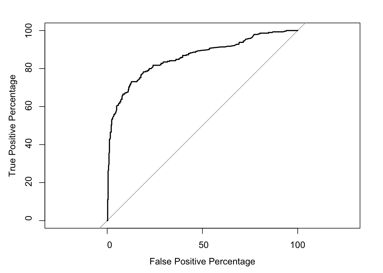
It should be noted that if we adjust the classification threshold from 0.5 to 0.3 then we will classify more people as surviving, thus causing an increase of False Positives. If we adjust the classification threshold from 0.5 to 0.8 we will classify more people as not surviving, and thus causing an increase of False Negatives. Altering the threshold will affect the precision and recall. In order to determine the “ideal” threshold we can experiment at each threshold value and plot the True Positive and True Negative Rate against each other. The values in the upper left-hand corner may indicate a threshold value we will want to use, but it is up to you to balance the need to reduce Type I and Type II errors.
This plot can be done in R and is called an ROC (Receiver Operating Characteristics) Curve. The arguments that need to be passed into the roc() function are the actual values (0/1) and the predicted probabilities for each observation. The function will also output the AUC (Area Under the Curve) which will allow us to compare different models, with the higher the AUC value the better.
With the output above, we can see the Area under the curve is \(85.94\%\). We will use this number to compare different models to each other. A model with an AUC of between \(0.5\) and \(0.6\) is essentially randomly guessing, a value between \(0.6\) and \(0.7\) is poor, a value between \(0.7\) and \(0.8\) is considered fair, a value between \(0.8\) and \(0.9\) is considered good, and a model with an AUC of between \(0.9\) and \(1.0\) is considered outstanding.
If we are interested in calculating the model with the best combined True Positive and False Positive value (top left corner of ROC curve) then we can use the coords() function. This will find the threshold value associated with the point closest to the top left corner. We should note that many threshold values should do the trick, and it is up to the user to decide which threshold value to use to balance the need for good precision and recall.