| College | Mean Attendance |
|---|---|
| Canisius | 847 |
| Fairfield | 2135 |
| Iona | 1822 |
| Manhattan | 769 |
| Marist | 2025 |
| Merrimack | 1462 |
| Mount St. Mary’s | 1888 |
| Niagara | 855 |
| Quinnipiac | 1510 |
| Rider | 1540 |
| Sacred Heart | 1209 |
| Saint Peter’s | 539 |
| Siena | 5044 |
2 Data Detectives
One of the goals of this class is learning how to describe data and use it to convey information about the variable of interest. To do this, we will need to discuss some basic statistical formulas that we will use throughout the semester. We will need to learn “how to do” the math in this section, but we should also put an emphasis on the meaning of each term and what it is telling us. Later on in this course, we will be able to calculate all of these formulas using computer software, but we will still need to know what the results are telling us.
- Understand the ways to describe the center and spread of a dataset, including mean, median, mode, range, and standard deviation, and what each measure conveys about the data.
- Interpret how outliers influence statistical measures and use tools like z-scores and standard deviation ranges to identify unusual observations.
- Compare and interpret center and spread within subgroups to draw meaningful conclusions about categorical variables.
Supplemental Material
2.1 Describing the Center
It may seem odd, but there are multiple ways to describe the center of a dataset. Sometimes we might want the center to describe the mathematical mean (the average on a test was 83.5), other times we might want it to describe the middle value (half of the students got above an 86 on the test), and other times we might want to describe it as the value occurring the most often (the most common grade on the test was an 89). All of these are acceptable ways to discuss the center of a dataset, but they still tell us very different things.
The first method we will discuss is probably something we are all familiar with, and that is the mean. The mean is the average value of the data set and is calculated by summing up all of the values and dividing by the number of observations. Next, we have the median, which is the middle value in the data set where half of the values are below it and half of the values are above it. To calculate the median we will order the observations from smallest to largest and then choose the middle observation. If there is an even number of observations then a middle value will not be present and you will need to take the mean of the middle two values to calculate the median. Finally, we have the mode. This is the value that occurs most often and is found by choosing the one that has the highest frequency. There may be no mode, one mode, or multiple modes depending on the dataset.
Below is an example of how we can calculate the center of the dataset using the three terms above. The data describes the average game attendance for the 13 basketball teams in the Metro Atlantic Athletic Conference for the 2024-2025 competition year.
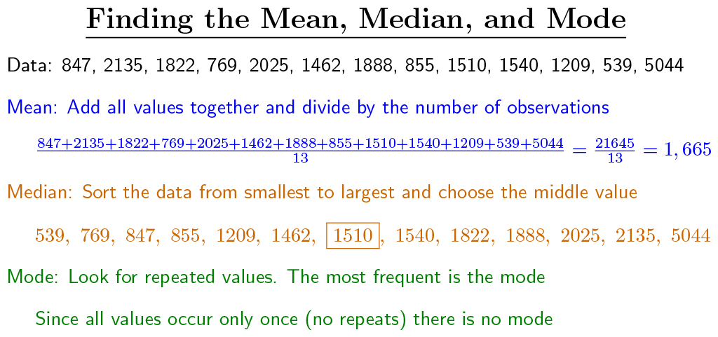
We can notice that both the mean (1665) and the median (1510) tell us very different stories about what the average attendance was at the basketball games. One reason for this is because the mean is impacted by extreme values, which we will call outliers. These are values that are much smaller or larger than the rest of the dataset. For our dataset, it appears that Siena is an outlier since their attendance is much larger than the rest of the conference. If we were to temporarily remove this value from the dataset the mean would drop to roughly 1383 while the median would only change slightly to 1486. Through this, we can see that the mean is heavily influenced by outliers while the median is relatively immune to them (the median changed a good amount in our dataset since we have relatively few observations, if we had 100 different schools then we would not expect the median to be affected by outliers).
Try it Out
Emmit is trying to evaluate how well-attended the recent campus speaker series was. After looking at the sign-in sheet he found they had the following attendance amounts:
\(52,\ 73,\ 84,\ 73,\ 82,\ 253,\ 82,\ 48,\ 73,\ 80\)
If Emmit claims that “around 90 people come to each event,” is that accurate?
Click to see the solution
2.2 Describing the Spread
Another way to describe a dataset is to talk about the spread of the data. Much like the center, this too can be done in several different ways. The first way we can do this is by calculating the range difference (often called the range). This takes the maximum value (5044) and the minimum value (539) and subtracts them from each other. This will give us a range difference (max - min) of 4505, indicating the data is spread out over 4505 values.
An alternative way to discuss the spread of data is by calculating the standard deviation. This is a measure that tells us how far apart on average the values are from the mean. This calculation requires a few steps, with the first being to calculate the mean of the data. Second, you will need to calculate how far each value deviates from the mean (that is the value - mean). Third you will need to square all of the deviations, with the fourth step being adding up all of these squared deviations. Finally, you will divide by the number of observations minus 1 and then take the square root. While this sounds complicated, it can be done by making a table. An example of this can be seen below:
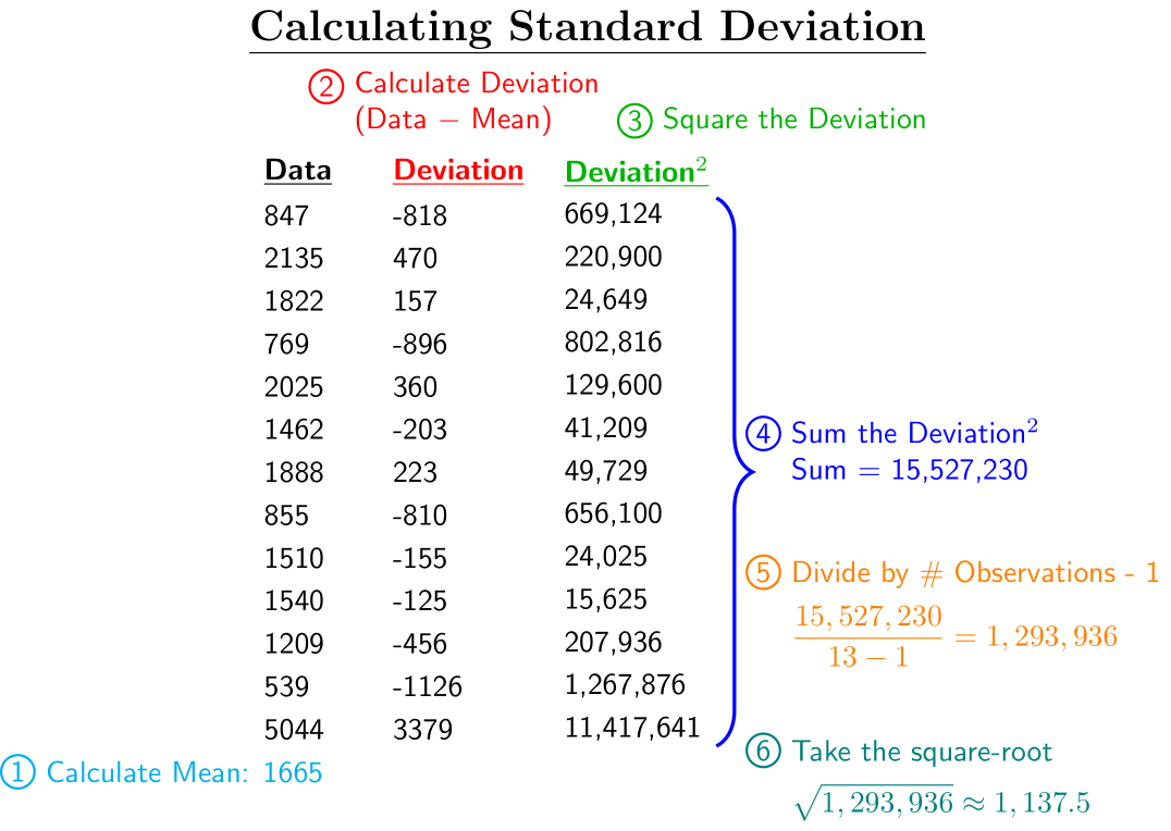
Looking at the example above, we can see that the data values are on average 1,137.5 away from the mean. Similar to the mean, the standard deviation is also affected by outliers. If we were to temporarily remove the outlier (Siena) then the standard deviation would drop to roughly 535.8 It is important to understand what the standard deviation is telling us and the general method for calculating it, as the topic will come up throughout this semester and your Data Science journey.
One of the many reasons why the standard deviation is important is because it allows us to compare datasets that might have different units. For instance, if we have a dataset describing heights and a dataset describing weights then just talking about the range difference or the standard deviation will not give us insight if one dataset is more spread out than the other. What might be beneficial is discussing the standard deviation range difference, as this is a statistical term to calculate how many standard deviations the maximum value differs from the minimum value. In our basketball attendance example, the standard deviation range difference will be \(\displaystyle \frac{4505}{1137.5}=3.96\). This tells us the data falls over a range of 3.96 standard deviations.
Try it Out
Emmit is helping the finance office estimate how much students spend weekly on coffee on campus. How can he best describe the spread of the data?
\(\$10,\ \$15,\ \$13,\ \$14,\ \$70,\ \$13,\ \$14,\ \$16,\ \$13,\ \$12\)
Click to see the solution
2.3 Calculating z-Score
Another useful technique to compare values is to determine how many standard deviations away from the mean values are. This might help us see if certain values are “extremes”. To do this we will find the standard score (also called the z-score) which is calculated as:
\[ \text{z-score}=\frac{\text{Observed} - \text{ Mean}}{\text{Standard Deviation}} \]
For our example, Mount St. Mary’s University has a z-score of \(0.20\) while a school that has an average attendance of 900 spectators has a z-score of \(-0.67\). Stating how far an observation is away from the mean in terms of standard deviations helps give it more meaning.
Try it Out
Emmit scores an 70 on a chemistry exam while his friend Mary scores an 85. The class average was 75 with a standard deviation of 3.5. What were their \(z\)-scores?
Click to see the solution
XXXX INSERT VIDEO XXXX
2.4 Visualizing the Data
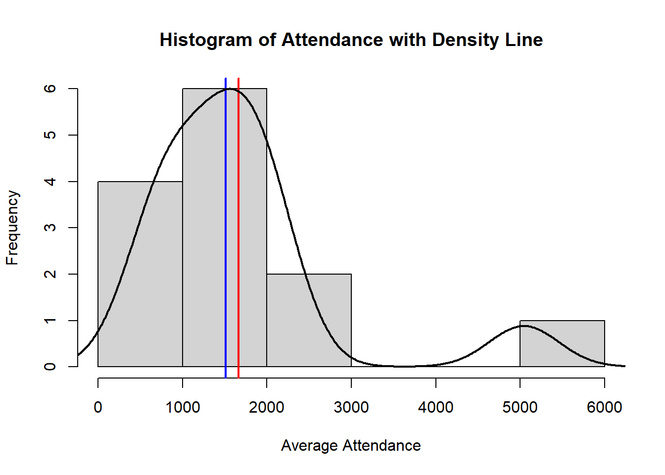
Visualizing data is also an important part of data science. We will discuss many visualization techniques later in the semester, but we do want to discuss a few big ones now. The first will be the histogram, which will help us visualize quantitative data. With this visualization, the height of the bar corresponds to how many observations have values within the interval. We should note that the bars are all touching each other since it is quantitative data. While this visualization will help convey information about the data, it does lose some of its detail due to the length of each category. In our visualization below, colleges that have an average attendance of 1001 and 1999 are lumped into the same category when one is almost double the other.
An additional technique that we will make use of throughout the semester is the density plot, which can be thought of as a smoothing curve for the histogram. It is more detailed than the histogram since it can highlight certain spots where more or less data lie and it alleviates some of the issues mentioned with histograms above. Below is a visualization of both of these included. The “red” line indicates the mean and the “blue” line indicates the median.
Try it Out
Emmit tracks how many hours he studies each day for two weeks. Help him visualize this data with a histogram.
\(2.5,\ 3.2,\ 5.4,\ 7.4,\ 2.1,\ 0.5,\ 1.4,\ 4.2,\ 2.1,\ 3.2,\ 0,\ 2.4,\ 4.4,\ 5.0\)
Click to see the solution
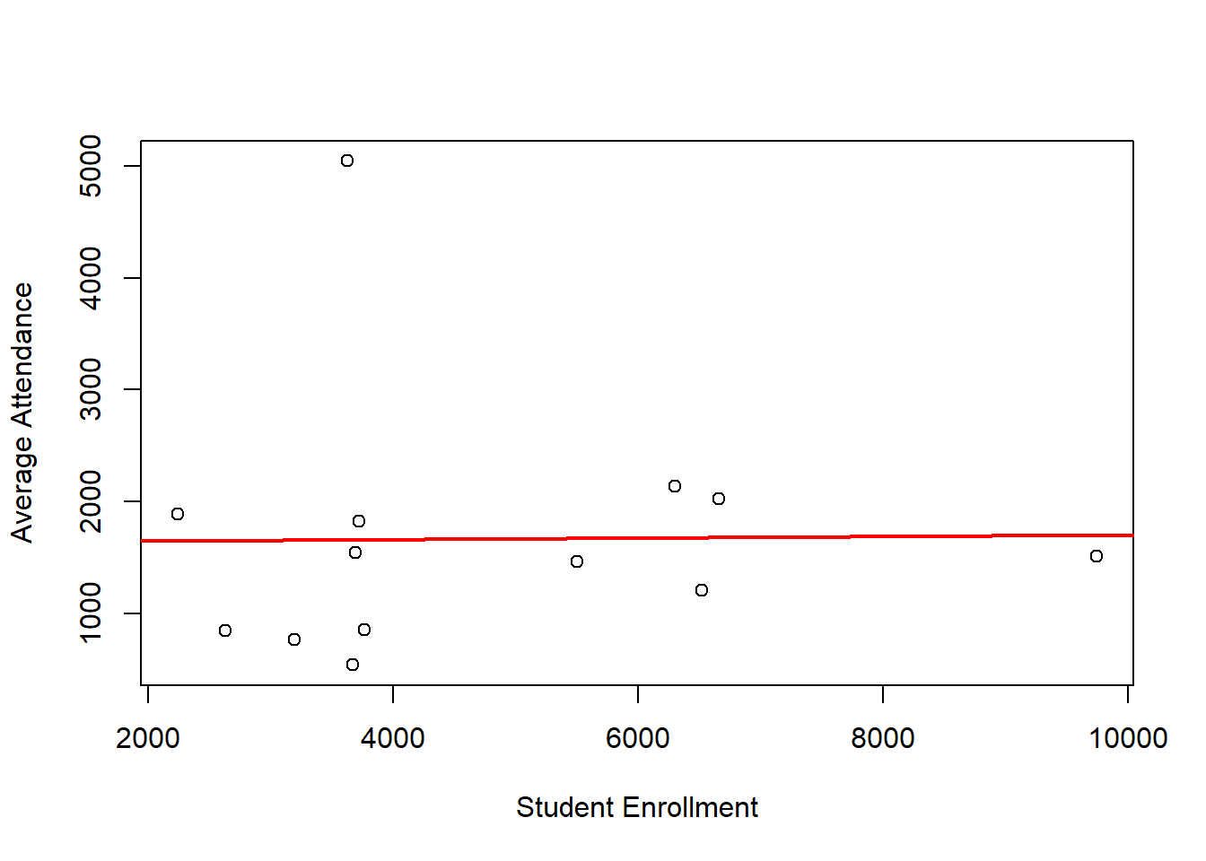
We can also use visualizations to try and determine if relationships exist between multiple variables. To do this we can use a scatter-plot, which will plot one variable on the \(x\)-axis and another variable on the \(y\)-axis. The points are plotted as ordered pairs. In future classes we will investigate how to describe the relationship of two variables using mathematics as well as learning how to calculate the line of best fit. Our example has been tweaked a little to include the student enrollment for each college in the conference. We will plot these points to see if a relationship exists between game attendance and student enrollment. We should stress though that just because a relationship exists does not mean that one variable causes the other variable to change. To quote the popular cliche: Correlation does not equal Causation!
Based on our plot, it appears that as student enrollment has no affect on basketball attendance. This does not make sense, as we would probably expect schools with more students to have more fans at the games. This may indicate that we are missing some other confounding variable that is causing some confusion in our results (like population of the surrounding area or even cost of attendance?).
| College | Mean Attendance | Student Enrollment |
|---|---|---|
| Canisius | 847 | 2630 |
| Fairfield | 2135 | 6298 |
| Iona | 1822 | 3720 |
| Manhattan | 769 | 3195 |
| Marist | 2025 | 6657 |
| Merrimack | 1462 | 5505 |
| Mount St. Mary’s | 1888 | 2240 |
| Niagara | 855 | 3763 |
| Quinnipiac | 1510 | 9744 |
| Rider | 1540 | 3693 |
| Sacred Heart | 1209 | 6524 |
| Saint Peter’s | 539 | 3673 |
| Siena | 5044 | 3623 |
2.5 Describing Qualitative Data
Everything we have discussed so far deals with quantitative data. We cannot describe qualitative (categorical) data the same way though, as it will not make sense to calculate and mean or the standard deviation of groups. What we can do though is describe it using counts. The example we have been using throughout this lecture is once again tweaked to include a new column, the state where the University is located, and whether or not the school is Catholic (C) or non-Catholic (NC).
| College | Mean Attendance | Student Enrollment | Religious | State |
|---|---|---|---|---|
| Canisius | 847 | 2630 | Catholic | New York |
| Fairfield | 2135 | 6298 | Catholic | Connecticut |
| Iona | 1822 | 3720 | Catholic | New York |
| Manhattan | 769 | 3195 | Catholic | New York |
| Marist | 2025 | 6657 | Not Catholic | New York |
| Merrimack | 1462 | 5505 | Catholic | Massachusetts |
| Mount St. Mary’s | 1888 | 2240 | Catholic | Maryland |
| Niagara | 855 | 3763 | Catholic | New York |
| Quinnipiac | 1510 | 9744 | Not Catholic | Connecticut |
| Rider | 1540 | 3693 | Not Catholic | New Jersey |
| Sacred Heart | 1209 | 6524 | Catholic | Connecticut |
| Saint Peter’s | 539 | 3673 | Catholic | New Jersey |
| Siena | 5044 | 3623 | Catholic | New York |
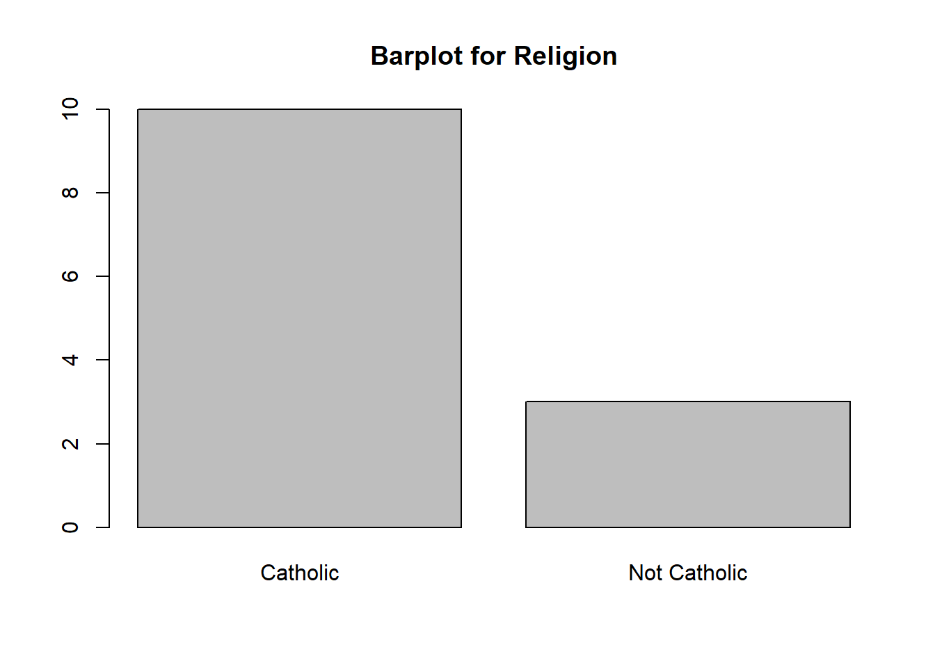
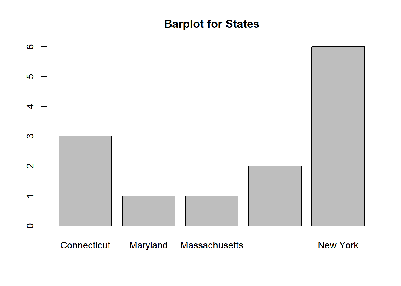
It is a relatively straightforward procedure, but we can do a count by category and see that 10 schools are Catholic and 3 schools that are not Catholic. We could do something similar with their locations and note that 6 schools are in New York, 3 are in Connecticut, 2 are in New Jersey, 1 is in Maryland, and 1 is in Massachusetts. To visualize categorical data we can use a barplot. This is similar to the histogram but the bars will not touch each other. Below is a visualization for both counts:
We can do a “more exciting” analysis with categorical data by calculating quantitative descriptions within their categorical groups. For instance, we could calculate the mean attendance for Catholic schools (1657) and compare it to the mean attendance for non-Catholic schools (1691.67). We could also do something similar for the school’s location:
| State | Mean Attendance |
|---|---|
| Connecticut | 1618.000 |
| Maryland | 1888.000 |
| Massachusetts | 1462.000 |
| New Jersey | 1039.500 |
| New York | 1893.667 |
Try it Out
Emmit surveyed 30 students, asking what type of student club they were in and how many hours per week they typically spent participating. Using the information below, help him create a bar chart for the number of students in each club type and then which club type has the highest average time commitment.
| Club Type | Hours per Week (per student) |
|---|---|
| Academic | 3, 4, 2, 5, 3 |
| Sports | 8, 10, 7, 9, 6, 10, 8 |
| Arts | 5, 4, 6, 5, 7, 4 |
| Service | 2, 3, 4, 3, 2, 1, 2, 3, 2 |